Case example: UX unification in F-Secure B2B/WithSecure

I started working as a Senior UX designer in F-Secure B2B products in 2016, when the UX unification was taking it's first steps. At that point there were several security management portals using web UI (different front end technologies), one very old using java and then mobile and computer apps. Each of them had their unique UI and unique behavior and they did not work together. This created extremely complex environment for users to navigate and understand.
NOTE: Due to confidentiality, some parts of the story are not able to be explained in details.
Content of the case example:
- Beginning of the unification 2016 - 2017: Unification guidelines based on newest and most used product, PSB (Protection service for Business)
- Collecting, defining and documenting the first UX framework, components and patterns
- Design system creation
- One portal
- Terminology unification
- Unified Elements product
Beginning of the unification 2016 - 2017: Unification guidelines based on newest and most used product, PSB (Protection service for Business)
When I joined in F-Secure B2B UX design team, the new UI for PSB (Protection service for Business product) was about to be released. The new portal design UX concept was created earlier by the design team and an external design agency (Idean). It was created to replace the old PSB UI Portal, with better UX and visual appearance. Next target for the design team and the B2B product organization at that time was then to align rest of the portfolio with the new PSB UI: to unify the information architecture, components, terminology and UX behavior.
At that time, as a senior UX Designer, I did UX design first for so called "web-clients", which were web UI's to manage settings of certain types of end-points. Web clients I re-designed were Internet Gatekeeper (IGK), Linux Security and Email and Server Security (ESS). I also did design for the B2B mobile app, F-Secure Mobile Protection, and later I took also the PSB product UX design responsibility. Understanding the PSB portal logic was crucial to be able to start aligning the other products. PSB portal new UX was validated with users (by Idean) and found many ways a good in usability. When the new UI was released to users, it mainly got just positive feedback, which reassured the plan to have it's UX concept as guiding light for rest of the products.
There was also even the bigger question of unification, about why do we have so many separate portals and why they don't work together. That question was not possible to address at that time, mainly because of organizational reasons.
Image: New F-Secure Protection Service for Business (PSB) portal 2016 and F-Secure Business Suite, Policy Manager portal.


Information architecture unification
The most fundamental part of the unification was the information architecture alignment, and that was one of the key drivers for the design team to get forward. Having the features and functions placed in same UI structure, with same terminology and functioning same way, so that the products would start feeling like a product family, and users would be able to know and learn the UI's easier.
Using the same core UI components was part of it. At that time there was no F-Secure B2B design system yet. Some parts of the code were able to be reused from other products, but mostly they were build separately. In UX design we were using visual component library (Adobe Illustrator) and the PSB product and it's UX specifications as guideline. Target was to get the products be aligned as much as possible.
I went thru the functionality of Internet Gatekeeper and Linux products (in 2016) and created the new UI information architecture for them. Understanding the very technical, cyber security logic of these products took some time, I interviewed the specialists in-house to gather the current functions, and why they were needed, then compared and mapped the functions with PSB product functions. After creating the UX concept for the products I made the UX design, layouts and the UI design and validated them with stakeholders and users. In 2017 Internet Gatekeeper product was changed to ThreatShield, and the concept needed to be updated for that.
Image: Main menu unification examples from IGK (Internet Gatekeeper) and ThreatShield.

Image: Main menu unification examples from ESS (Email and Server Security).

Brand, visual and UI framework unification and updates 2016 - 2017
Some of the older products were really outdated by the look and UX behavior. Taking the product UI's to the new visual style, the correct brand style and same UX was major part of the unification work in the beginning. F-Secure B2B brand also changed several times which required several rounds of visual updates in the products. This was of course time consuming. After getting the F-Secure B2B design system first versions out, certain visual updates for Web UI became much more faster.
In 2017 we also started to design an updated UI framework, which was more flexible and supported better the needs of the security management tooling. The target customer was changed at that time to larger, mid-market customers with larger organizations to manage, which meant that the UI should handle huge amounts of data, and be able to match to needs of security management professionals. Data visualization and scalability of the UI became important drivers.
Objective and long term vision was to have the B2B products unified and harmonized. Starting with
- Harmonizing and improving UX across Corporate products Home views content and main structure
- Unification of web portals
- Unifying consumer based applications to corporate UX
- Simplification of UI structure
- Visualize large amounts of data or complex system descriptions in to quickly understandable and (context) actionable format.
- Unify terminology
- Corporate UX language: Corporate products should have same interaction logic
Image: example of 2016 visual, brand and UI component update of IGK.

Image: example of 2017 visual, brand and UI component update, and IGK to ThreatShield product.

Image: example of 2017 visual, brand and UI component unification: changing the consumer PC application, F-Secure SAFE, to B2B application, Computer Protection, and aligning it with B2B brand, terminology and functionality.

Image: example of 2017 visual unification: changing the consumer mobile application, F-Secure FREEDOME, to B2B application, Mobile Protection.

Image: example of 2017 UI framework update for product portals: Application layout, navigation components and brand elements change and unification. UX vision was that all the web UI’s would eventually start using the same UI framework, which was the ground for the design system development.

Documenting UX framework, components and patterns
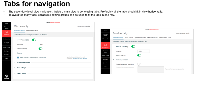
During 2017 when the design team and unification needs were growing, I started collecting and documenting the "F-Secure B2B Common UX framework". I collected, defined and wrote guidelines for UX information architecture, UI components and UX patterns. These definitions were the initial UX building blocks for our own design system, Harmony Design System (HDS) in F-Secure B2B. At that time it was easiest to collect everything in one ppt document, so that the guidelines would be easily accessible by everyone in the organization. Around 2020 the component descriptions and patterns were moved to the design system web pages, and in 2022 we started documenting the UX patterns in Figma tool.
Image: Overall there was close to 100 pages in the original UX guidelines document. Here are few examples. Click to see larger.
Design system creation
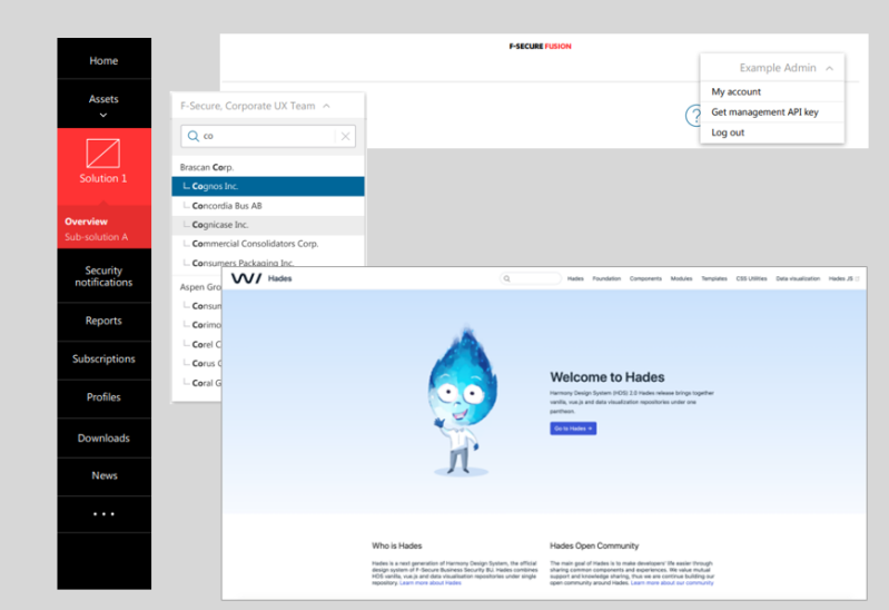
F-Secure B2B design system was created in the UX Design team to solve the unification, speed of work and quality in front-end coding and design. Design system was originally designed, planned and lead by the Lead Visual Designer, the work was initiated around 2017. It took some time to get the basics agreed with RnD and for example choose the front end technology. But eventually there was the basic UI framework available for designers and developers in "Harmony Design System" (HDS). The idea and goal for the design system was to have all the guidelines in the same place for designers, developers and product management.
Without the HDS design system for Web UI's in F-Secure B2B, the next phases of the unification would not have been realistic to plan. The major success and benefits immediately were the brand change related needs and fast front-end development of new products.
Image: example components and HDS Design System Web site .
One portal
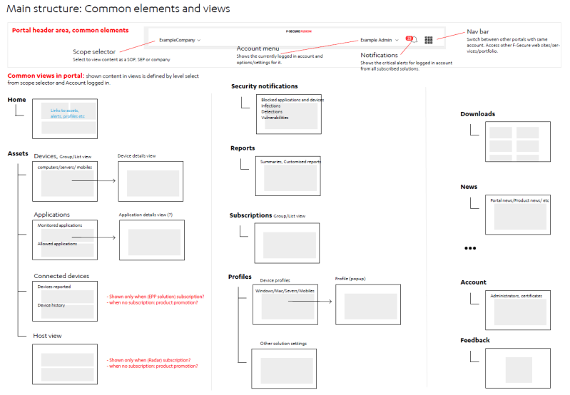
By end of 2017 the problem of product fragmentation, several separate portals with separate access control was prioritized in product organization. The first UX unification between portals was the common access control and SSO, which helped in moving between tools. We started to create UX concept for one portal and I made the first UX design draft for the the initial concept based on the learning from product unification so far. The first idea was to have combination of "common views" and then product specific solution views. The need for common views came from the fact that the separate product portals had several same or similar views, like list of devices or assets, software, notifications and alerts, support, downloads etc.
One portal creation would also require deep understanding of who are the users and how they use the portal, and what would be optimal for them. Understanding the focus users of security management was one of most important projects when I started my work as Lead Service Designer in 2018 at F-Secure B2B. (More details about the service design and research, in another case example.)
First thing for one portal UX concept was to create UX information architecture map, using the B2B UX framework as basis.
Image: examples of one portal UX content mapping. Click to see larger.
One portal concept goal was to merge the existing security management portals to one, but also to scale further. Scaling and flexibility to add more capabilities was one important driver. Flexibility was also needed because many of the customers had only one or two products in use, so there needed to be a way for the portal to work well in different subscription scenarios.
Image: examples of one portal UX concept scalability for different subscriptions. Click to see larger.
Terminology unification
In 2016 when the first UX unification round was ongoing, one of the biggest usability problems was the inconsistency of terminology between the products. There were many products which were basically doing the same security operations, but in different context or platform - like products for Linux or Windows, computers or servers, and cloud or in-premise solutions. There were some core, functions which meant exactly same thing, but were using different terminology in different products.
I got task to start the terminology unification work. I collected all the main functions related terms from the main F-Secure B2B End-Point Protection products. Back then those were PSB (Protection Service for Business) which was cloud based solution, and Business Suite, the on-premise solution. The main UI for Business Suite was Policy Manager, a java based security management portal. Both of them had generated the terminology in their UI's separately, even though the functions were pretty much the same. I listed the terms in an excel sheet, made the comparisons and correction proposals. Together with language and terminology specialists in-house, we reviewed the unification plan and went it thru with stakeholders in different projects. The initial list of unified terms was created and the products eventually implemented the changes during 2017.
In 2018 I transferred to Lead Service Designer role in F-Secure B2B and was not able to lead the terminology unification at that point. When nobody was driving, the initiative went on hold. I returned back to UX in 2021 - 2022 to lead the team, and at that point there had been new features and products which had again generated the terminology inconsistency. We returned back in terminology unification to unify the terms used inside Elements product. New and updated list for unification was created and reviewed and many things were agreed, but the work is still ongoing. When the area is very technical and specific, like cyber security, having a good, one term for a topic can be difficult, even to understand if the topic is same or not. Many times compromises are needed. The main thing should be that it is logical and used systematically inside company, but also to ensure that it matches with possible standards or best practices in the industry.
Unified Elements product
When I changed the role inside company from Senior UX designer to Lead Service Designer at 2018, I concentrated on customer and product usage and needs understanding and research for couple of years. I returned back to help in the UX design in 2021 in role of Senior Program Manager for customer experience. During those years there were some changes in the design team and product organization, which resulted to steps back in the unification work. The design of different products was done separately and UX patterns creation and usage was on hold. We had to restart the unification work and collecting and agreeing the UX patterns again. Unfortunately during those years there had been designed and developed inconsistent behaviors in the UI's. When we started to put the products together in the same portal, there were a lot of functions which should have been designed and done same way but were not. This caused a lot or re-work in unification in following years. Also the other parts of product development organization were still very heavily in the "solution mode", concentrating only on their area and not for the one and full product and it's experience.
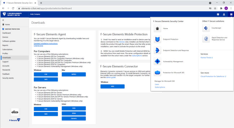
But still the great new one portal was about to be reality in 2021. The first version of it was released in the spring 2021. Where all four major security management products (solutions) were found inside one product, "F-Secure Elements". Also the names of the solutions (subscription names) had to be changed to more integrated and better fitting to one environment. For example PSB was changed to "Endpoint Protection" (EPP). Even though they were inside one portal, in the first versions the solutions were acting as their own without linkage between each other.
Image: example of F-Secure Elements 2021. The brand had changed also one more time for F-Secure B2B. The blue brand change was relatively fast to do with the HDS design system.
There was lot of work done in product management, design and development to get the Elements portal to work as one product. During years 2022 - 2023 I was leading the design team as Head of Product Design. Elements unification and vision was our core objective during those years.The unification work meant a big focus in the design system and UX patterns design and alignment. Turning a big machine of product development which consisted of tens of development teams, was not easy.
Image: visualization of the unification and UX pattern "process" for designers. Removing the inconsistencies required many compromises in "Minimum Viable Product UX", often we were not able to do the optimal solutions from usability point of view. We tried to find a solutions which are fast to develop, but still would take the UX forward to the future optimal solution in next releases.

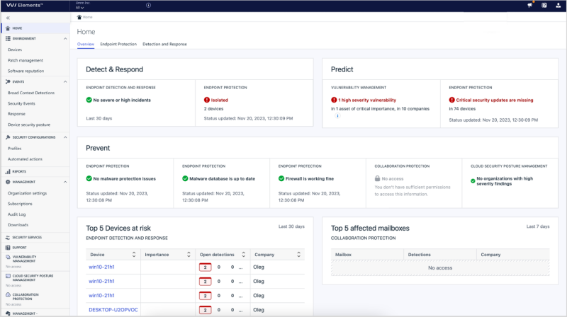
In end of 2023 we were finally able to start merging the solutions so that the products would start benefit each other more and more. This would not have been possible without having Elements UX vision. With the vision we were able to show and explain to the organization where we are aiming and why. (More about the UX vision, in another case example.)
As an end result of "evangelism" and presentations about why UX unification needs to be done now, we were also able to get agreement about the unification or front-end. Having the front-end actually unified and solutions fully merged would still of course take time, but if all goes well, the future of unified Elements user experience looks promising.
Image: Example of Elements product portal 2023. Endpoint Protection and Endpoint Detection and Response solutions merged and more common views added. When we are doing unification "on the go", the releases of the product can sometimes look messy when some parts of the product go forward faster than others. But when doing fast releases in agile software development, the UX compromises are inevitable, and we just need to try find the best balance of what is acceptable in UX point of view in the intermediate releases towards to the vision.
Continue reading the story "retrospective": What went well and what should have done differently in UX unification?
Read the introduction: Why there should be UX unification in general?






Create Your Own Website With Webador